Case Study: Branding
Office of Diversity, Equity, & Inclusion
Amplify the Voice of a Department
The Diversity Coordinator at Rocky Mountain College of Art + Design (RMCAD) needed branding for the Office of Diversity, Equity, & Inclusion that empowered students. As the college’s Brand Manager, I was excited to help design a visual representation for their important platform that fit within existing brand guidelines.


Mark Strategy
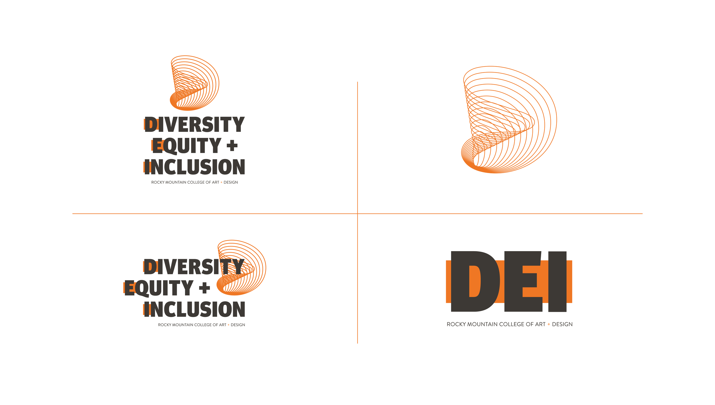
On the word mark, I took the goal of highlighting the department quite literally — using RMCAD’s brand orange to call out the DEI acronym.
Following the client’s thumbprint images, the accent mark uses the DEI acronym to enhance the theme of diverse yet unified identities.

Typography
After exploring type designers from many backgrounds, we landed on Meta Headline Pro because of its strength and compatibility with the existing RMCAD logo. As a collaboratively designed typeface, it perfectly aligns with the department’s mission.


Applications
E-mail Newsletter
Digital Promotions
Wordpress Website Page
Print Brochure
Blog Interview

Imagery
RMCAD usually uses tons of color images, so black and white imagery and a focus on message helped the department stand out without compromising existing brand guidelines.