Case Study: Logo Development
snd.wave
Helping A Music App Find Their Sound
The snd.wave app gives users with the most accurate music stats daily, so you never have to guess how many hours of hip-hop have filled your life. They needed a modern, color-adaptive logo that explained who they are in a glance. I was tasked with designing their brand foundation.

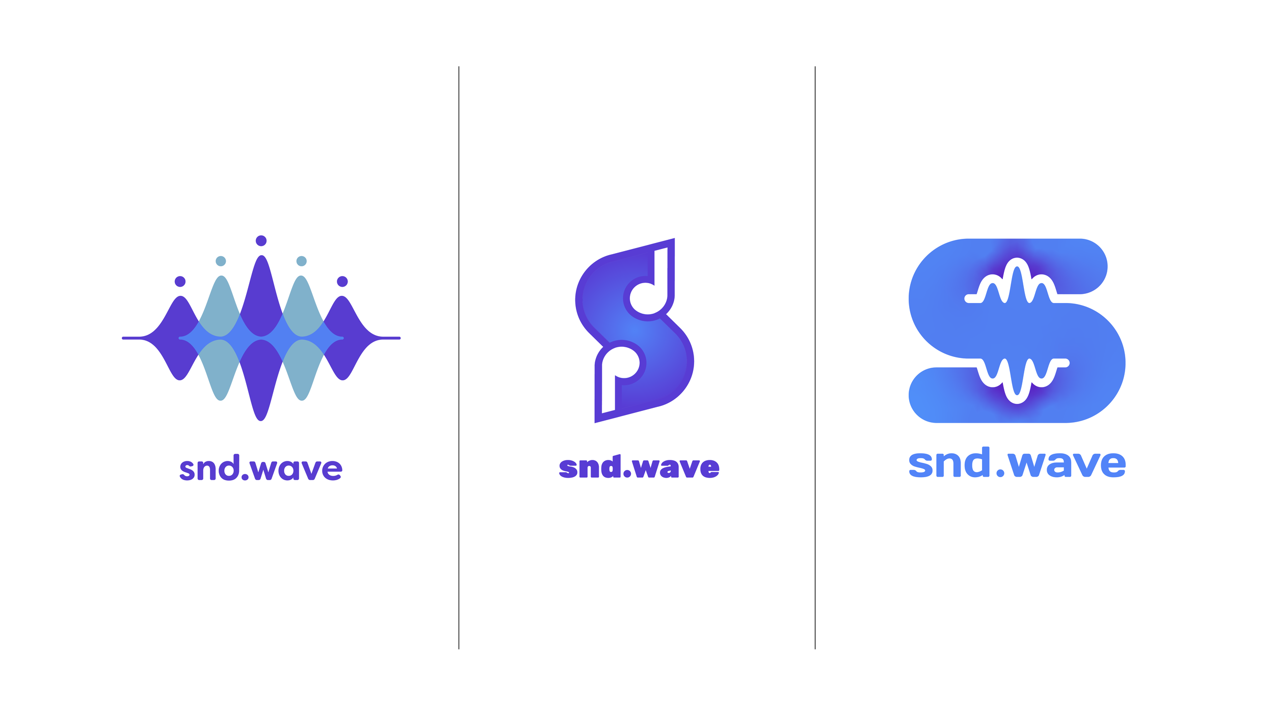
The Mark
During the exploration process, I studied competing app logos and gave consideration to classic symbolism.
By combining familiar icons from music and data with bright colors, we reminded our audience that snd.wave delivers the joy of a “Year In Review” every day.


Word Mark
The snd.wave word mark further enforces the brand services by using a custom adaptation of Filson Soft Bold to give a subtle nod to the music note.

Color Theory
Hip-hop is the app’s #1 genre, so we tapped some of our favorite albums to build a bold and bright palette around the brand’s existing color scheme.


Mono Logo
Logos have to look good in plain black and white for a variety of reasons. By dividing the color overlays of the main mark, I created depth and an easily recognizable monotone variation.